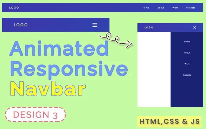
Live Preview
index.html
<!DOCTYPE html>
<html lang="en">

    <head>
        <meta charset="UTF-8">
        <meta http-equiv="X-UA-Compatible" content="IE=edge">
        <meta name="viewport" content="width=device-width, initial-scale=1.0">
        <link rel="stylesheet" href="style.css">
        <title>Responsive Navigation Sidemenu</title>
    </head>

    <body>
        <nav>
            <div class="logo">
                <h4>Logo</h4>
            </div>
            <ul class="nav-links">
                <li><a href="#">Home</a></li>
                <li><a href="#">About</a></li>
                <li><a href="#">Work</a></li>
                <li><a href="#">Projects</a></li>
            </ul>
            <div class="burger">
                <div class="line1"></div>
                <div class="line2"></div>
                <div class="line3"></div>
            </div>
        </nav>
        <section class="home"></section>
        <script src="main.js"></script>
    </body>

</html>
style.css
@import url('https://fonts.googleapis.com/css2?family=Poppins:wght@200;300;400&display=swap');* {margin: 0;padding: 0;box-sizing: border-box;}html{font-family: 'Poppins', sans-serif;}nav {position: fixed;top: 0;width: 100%;display: flex;justify-content: space-between;align-items: center;min-height: 8vh;background-color: #3142ae;background-image: linear-gradient(315deg, #3142ae 0, #3a39aa 74%);padding: 20px 60px;}.logo {color: rgb(226, 226, 226);text-transform: uppercase;letter-spacing: 5px;font-size: 20px;}.nav-links {display: flex;justify-content: start;gap: 4rem;}.nav-links li {list-style: none;}.nav-links a {color: rgb(251 251 251);text-decoration: none;letter-spacing: 1px;font-weight: 500;font-size: 15px;}.burger {display: none;}.burger div {width: 25px;height: 3px;background-color: rgb(226, 226, 226);margin: 5px;transition: all 0.3s ease;}@media screen and (max-width: 1024px) {.nav-links {width: 60%;}}@media screen and (max-width: 768px) {body {overflow-x: hidden;}.nav-links {position: fixed;right: 0px;height: 100vh;top: 10.2vh;background-color: #1a2173;display: flex;flex-direction: column;align-items: center;width: 50%;transform: translateX(100%);transition: transform 0.5s ease-in;padding-top: 10vh;}.nav-links li {opacity: 0;}.burger {display: block;cursor: pointer;}}.nav-active {transform: translateX(0%);}@keyframes navLinkFade {from {opacity: 0;transform: translateX(50px);}to {opacity: 1;transform: translateX(0);}}.toggle .line1 {transform: rotate(-45deg) translate(-5px, 6px);}.toggle .line2 {opacity: 0;}.toggle .line3 {transform: rotate(45deg) translate(-5px, -6px);}main.js
function navSlide() {
    const burger = document.querySelector(".burger");
    const nav = document.querySelector(".nav-links");
    const navLinks = document.querySelectorAll(".nav-links li");

    burger.addEventListener("click", () => {
        //Toggle Nav
        nav.classList.toggle("nav-active");
        //Animate Links
        navLinks.forEach((link, index) => {
            if (link.style.animation) {
                link.style.animation = ""
            } else {
                link.style.animation = `navLinkFade 0.5s ease forwards ${index / 7 + 0.5}s`;
            }
        });
        //Burger Animation
        burger.classList.toggle("toggle");
    });
}
navSlide();